Sharpe Ratio 3.0 a month before collapse. Why “perfect” returns are a red flag, not an achievement

In this article, we’ll explore why an unusually high Sharpe Ratio can be a warning sign, how smooth returns may hide tail risk, and why real strategy quality should be judged not only by beautiful metrics, but by how capital behaves during market stress.
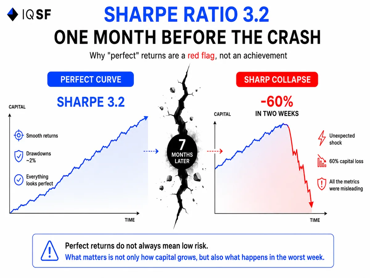
We were looking at a report from one fund. Sharpe Ratio 3.2, an almost straight upward equity curve, drawdowns within a couple of percent. The manager was proud of the number.
Seven months later, the fund lost 60% of its capital in two weeks.
This is not rare. In our capital management practice since 2019, we have seen the same pattern again and again: the more beautiful the Sharpe Ratio looks before a collapse, the deeper the collapse itself can be.
A high Sharpe is not bad by itself. The industry values it for good reason. But when it becomes abnormally high, especially on a short track record, it is no longer a ready-made proof of skill. It becomes a question that needs to be answered: where exactly did this number come from?
What Sharpe Ratio actually measures
Sharpe Ratio is the return of a strategy above the risk-free rate divided by volatility.
In simple terms: how many units of return you receive for each unit of “shaking” in the account.
The logic is straightforward. Two funds both return 20% per year. The first moves up and down by 30%. The second moves much more smoothly, with fluctuations around 8%. The second fund has a higher Sharpe, and intuitively it looks better.
Usually, that is true.
The problem is one word: volatility.
Sharpe treats risk only as price fluctuations up and down. But the most dangerous risk in the market often looks completely different.
Where the formula goes blind
Volatility and risk are not the same thing.
There are strategies where returns look smooth and stable almost all the time, and then a collapse happens. The Sharpe formula does not see this until the very moment of the explosion.
A classic example is selling out-of-the-money options, often described as collecting premiums.
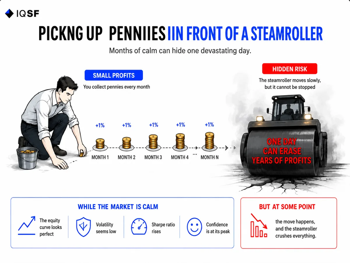
The strategy generates small, stable profits month after month. The equity curve is almost a straight line. Sharpe moves toward 3 and above.
Then a sharp market move happens, and one trade wipes out two years of profits.
In the industry, this is called “picking up pennies in front of a steamroller.” The steamroller moves slowly, remains invisible for a long time, and the curve looks perfectly smooth until the moment it arrives.
Why a high Sharpe is often a symptom, not a diagnosis
Let us break down the mechanics.
To get a very high Sharpe Ratio, there are two paths.
- The honest path: find a real market inefficiency, which is extremely rare and usually short-lived.
- The statistically dishonest path: hide the risk in a way that does not show up in volatility.
The second path is much more common.
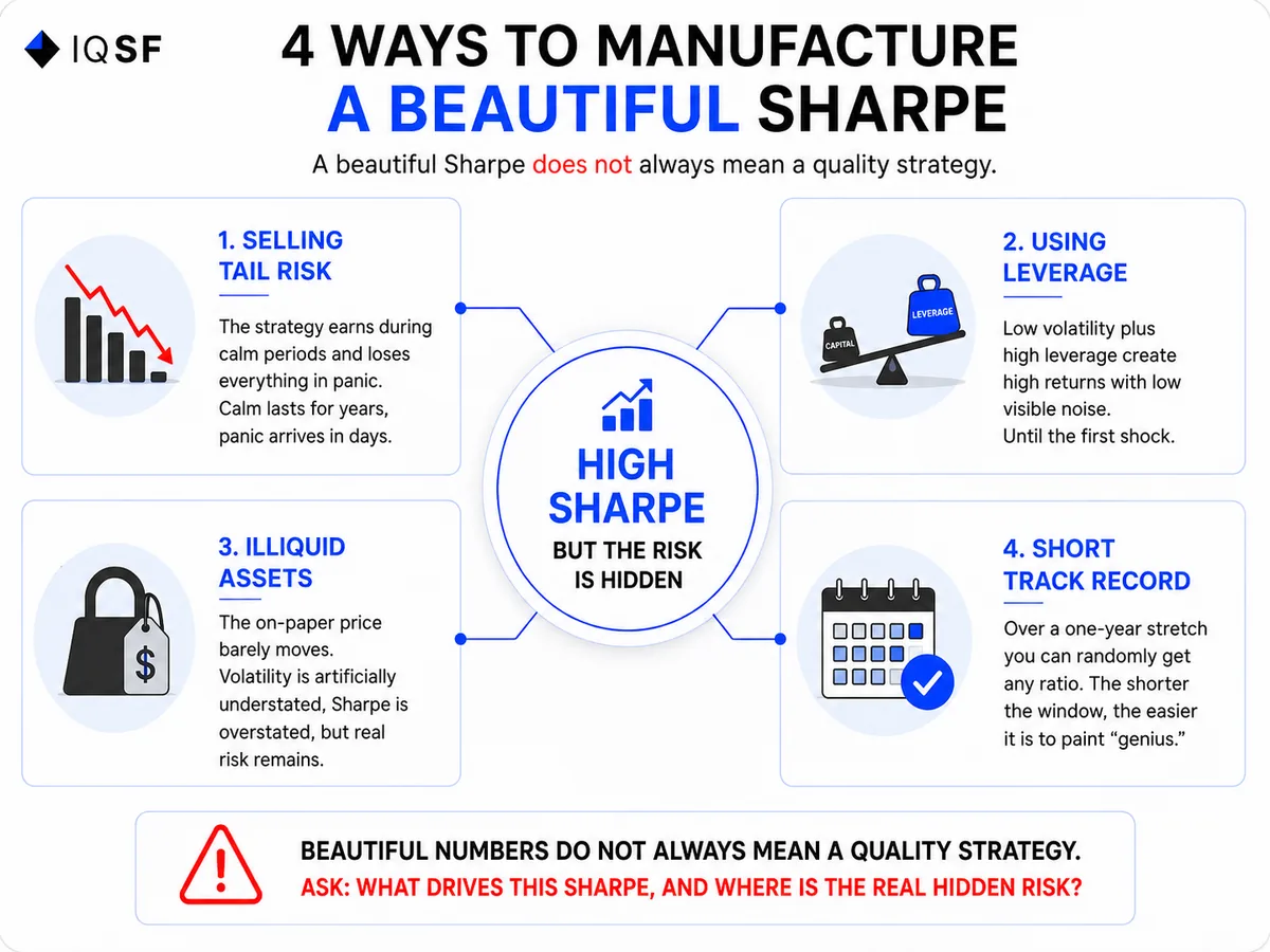
Here are typical ways to get a “beautiful” Sharpe while hiding real danger.
- Selling tail risk. The strategy makes money in calm markets and loses everything in panic. Calm can last for years. Panic arrives in days.
- Using leverage on a “stable” asset. Low volatility plus high leverage can create strong returns with low visible shaking. Until the first shock.
- Illiquid assets. If an asset is rarely revalued, its price barely moves on paper. Volatility is artificially understated, Sharpe is overstated, and the real risk has not disappeared.
- A short track record. Over a one-year period, almost any ratio can appear by chance. The shorter the window, the easier it is to make “genius” look real.
Numbers that bring You back to reality
LTCM, the fund led by two Nobel Prize winners, showed excellent risk-return metrics for several years in a row. In 1998, it lost around $4.6 billion in a matter of months and almost brought down the financial system. Before the collapse, its metrics looked exemplary.
The famous “delta-neutral” story of Amaranth Advisors followed a similar pattern. The fund showed smooth returns and then lost around $6 billion in one week in 2006 on natural gas futures.
Dozens of crypto funds in 2021 proudly showed Sharpe above 4 on staking and farming strategies. In 2022, half of them no longer existed. The smooth return profile was not skill. It was the absence of a stress test.
The pattern is always the same: one week before the blow-up, the metrics often look the best they have ever looked.
How we read Sharpe Ratio at IQSF
We do not treat a high Sharpe as a positive by default.
We treat it as a question that needs to be answered.
Here is what we check, and what we recommend investors ask.
- How long is the track record? A Sharpe calculated on a period of less than three years says very little. You need a window that includes at least one crisis.
- How did the strategy behave in March 2020, in 2022, or during any real shock? If the curve did not move during those weeks, that is not automatically strength. It is a reason to look for hidden risk.
- What creates the smooth returns? If the answer is option selling, leverage, or illiquidity, the smoothness may be deceptive.
- What is the shape of the loss distribution? Small frequent gains and one rare giant loss are the classic “pennies in front of a steamroller” profile. Sharpe can hide it.
- What do Sortino and maximum drawdown show? Sortino penalizes downside movements, not all fluctuations. A large gap between a high Sharpe and a weak Sortino can reveal hidden tail risk.
A simple numerical example of how smoothness can mislead
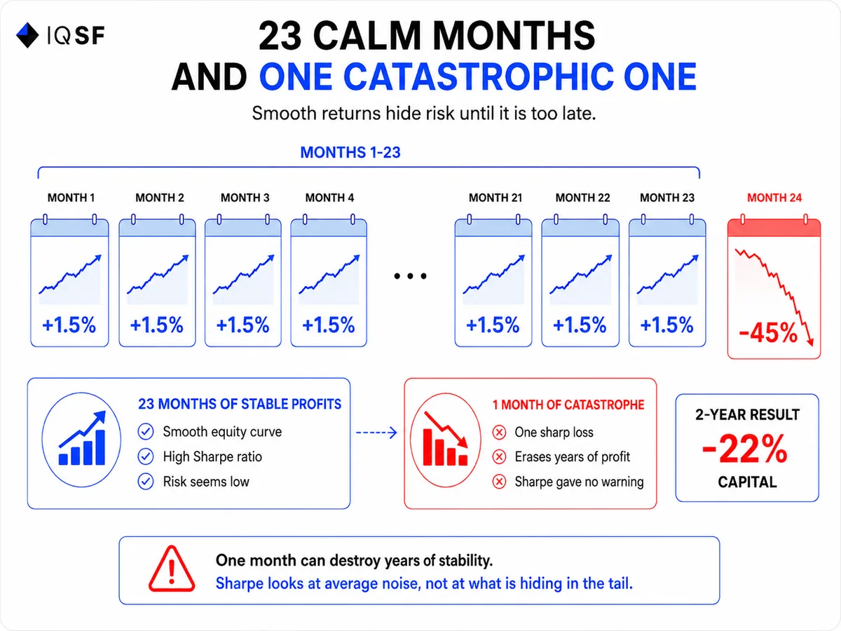
Take two strategies over two years, 24 months each.
The first strategy returns exactly +1.5% every month. No drawdowns, a perfect straight line. Sharpe becomes extremely high because volatility is almost zero. The total result over two years is around +43%.
The second strategy also returns +1.5% for 23 months, but in the 24th month it loses 45% in one week during a sharp market move.
The same smooth monthly gains kept Sharpe high almost until the very end. The formula did not “suspect” the catastrophe.
The total result over two years is around -22%.
The difference comes from one single month. But that month is the entire risk, and Sharpe Ratio did not show it during the previous 23 calm months.
That is why in our practice we do not look only at average smoothness. We also look at what is hidden in the tail of the distribution, in those rare weeks that can define the entire result.
An analogy that explains everything
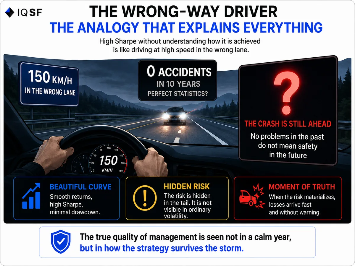
Imagine a driver who has been driving 150 kilometers per hour in the oncoming lane for ten years and has never had an accident.
Statistically, he has an ideal “ratio”: zero accidents and maximum speed.
Would you get into his car?
A high Sharpe without understanding how it was achieved is exactly that driver.
The absence of accidents in the past does not mean safety. It only means the accident has not happened yet.
The main point
A perfectly smooth equity curve is not proof of skill.
More often, it is proof that risk is hidden where the formula cannot see it.
The true quality of management is not visible in a calm year. It is visible in how the strategy survives a storm.
That is why, in our experience, the right question is not “What is your Sharpe?”
The right question is: “Why is it that high, and what happens in the worst week?”
A number without that answer is marketing, not a metric.
At IQSF, we break down these things without decoration: where the industry creates beauty on paper, and where real risk is hiding.
If you prefer a sober view of numbers over glossy reports, join our Telegram.
Frequently asked questions
Why can an unusually high Sharpe Ratio be a warning sign before a collapse?
An abnormally high Sharpe Ratio can be a warning sign because unusually smooth returns often hide risk that does not show up as volatility until it is too late. In IQSF's practice since 2019, the pattern has repeated: the more beautiful the Sharpe Ratio looks before a collapse, the deeper the collapse can be. One fund with a Sharpe of 3.2 lost 60% of its capital in two weeks just seven months after that report.
What does the Sharpe Ratio fail to capture about risk?
The Sharpe Ratio treats risk only as price fluctuations up and down, so it misses risks that stay hidden until they suddenly appear. Selling out-of-the-money options can show small, stable profits and a Sharpe near 3 or above for years, then lose two years of profits in one trade when a sharp move hits. Leverage on a seemingly stable asset or illiquid assets can also produce a beautiful Sharpe while real risk stays hidden.
What real fund collapses illustrate the danger of a too-smooth return curve?
LTCM, led by two Nobel Prize winners, showed excellent risk-return metrics for years before losing around $4.6 billion in months in 1998. Amaranth Advisors showed smooth returns before losing around $6 billion in one week in 2006 on natural gas futures. Dozens of crypto funds showed a Sharpe above 4 in 2021, and by 2022 half no longer existed, since smooth returns reflected no stress test.
How long a track record is needed before trusting a Sharpe Ratio?
A Sharpe Ratio calculated on a period shorter than three years says very little, since over just one year almost any ratio can appear by chance. A trustworthy window needs to include at least one real crisis, such as March 2020 or 2022, so it is possible to see how the strategy actually behaved under stress. If the curve did not move during those periods, that is a reason to look for hidden risk rather than automatic proof of strength.
What questions help reveal hidden risk behind a smooth equity curve?
Useful questions include how long the track record is and whether it covers a shock such as March 2020 or 2022, what creates the smooth returns, such as option selling, leverage, or illiquidity, and the shape of the loss distribution. Comparing Sharpe with Sortino and maximum drawdown also helps, since a gap between a high Sharpe and weak Sortino can reveal hidden tail risk. The right question is not what the Sharpe is, but why it is that high.