Copy trading: how not to lose your deposit

In this article, we’ll explore why a perfect equity curve in copy trading can hide serious risk, how high win rates and smooth returns may signal dangerous mechanics, and what investors should check before choosing a strategy to avoid losing their deposit.
A beautiful equity curve with no drawdowns does not mean low risk. It means the risk has not yet materialized.A strategy is evaluated on a long chart, but the decision is made based on a short segment of the chart. Most losses live in this gap: strategies that look best over one or two months are often the worst at surviving the first real market shock.
Below, we examine real trading examples from public copy trading platforms: nine accounts that went to zero, a manager with a 99.82% win rate, independent regulatory data, and a chronology of Bitcoin crashes. All of this answers one practical question: how to choose a strategy so that deposit protection does not depend on whether the market enters a scenario that the model did not expect.
Cover the right side of the chart with your hand
This is an exercise worth doing before any decision. Below is a real equity curve from a copy trading platform. First, look only at the upper image: the right side of the chart is covered by a placeholder, just as it is covered in real life. At the moment of choice, no one knows what comes next.
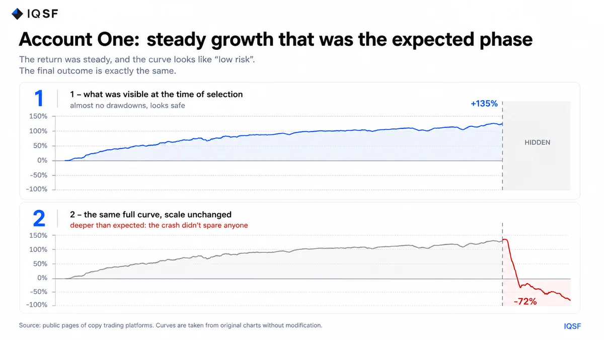
Chart 1. Above is what the subscriber saw: growth of up to +135% with almost no drawdowns. Below, the placeholder is removed: the same account falls to -72%, and at one point to -80%.
Almost everyone chooses this curve, and that is understandable: it looks like the result of a mature system with low risk. The next thought comes naturally: if the risk is low, the amount can be increased. This is how risk reassessment works. It is also how FOMO works, pushing people to enter a strategy exactly after the most impressive part of the growth.
The important detail in this comparison is that nothing changed between the two images except the removal of the placeholder. The same scale, the same width, the same curve on the left side. So the collapse cannot be blamed on a change in chart scale. This is exactly what happened to the account, shown in the same coordinates in which the decision was made.
The account did not return to zero profit. It fell below the starting point. What was lost was not the return, but most of the deposit, and not after months of slow decline, but almost vertically.
It is not about greed for multiples, but about the wrong strategy choice
It is easy to decide that the problem was the pursuit of huge returns. The next example disproves that. There is nothing aggressive here: moderate returns and calm behavior, exactly the kind of curve a cautious person would choose when consciously avoiding aggressive strategies.
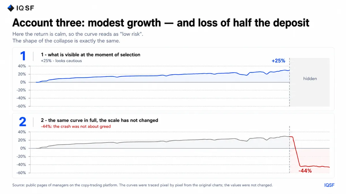
Chart 2. Growth of around +25% over two months, with two small dips. One movement takes the account down to -44%.
One movement erased all the profits and almost half the deposit. A modest return did not mean modest risk. It only meant that the risk had not yet materialized. You could object: both curves were too smooth, while a real system should look more honest, with visible drawdowns. There is such an example too.
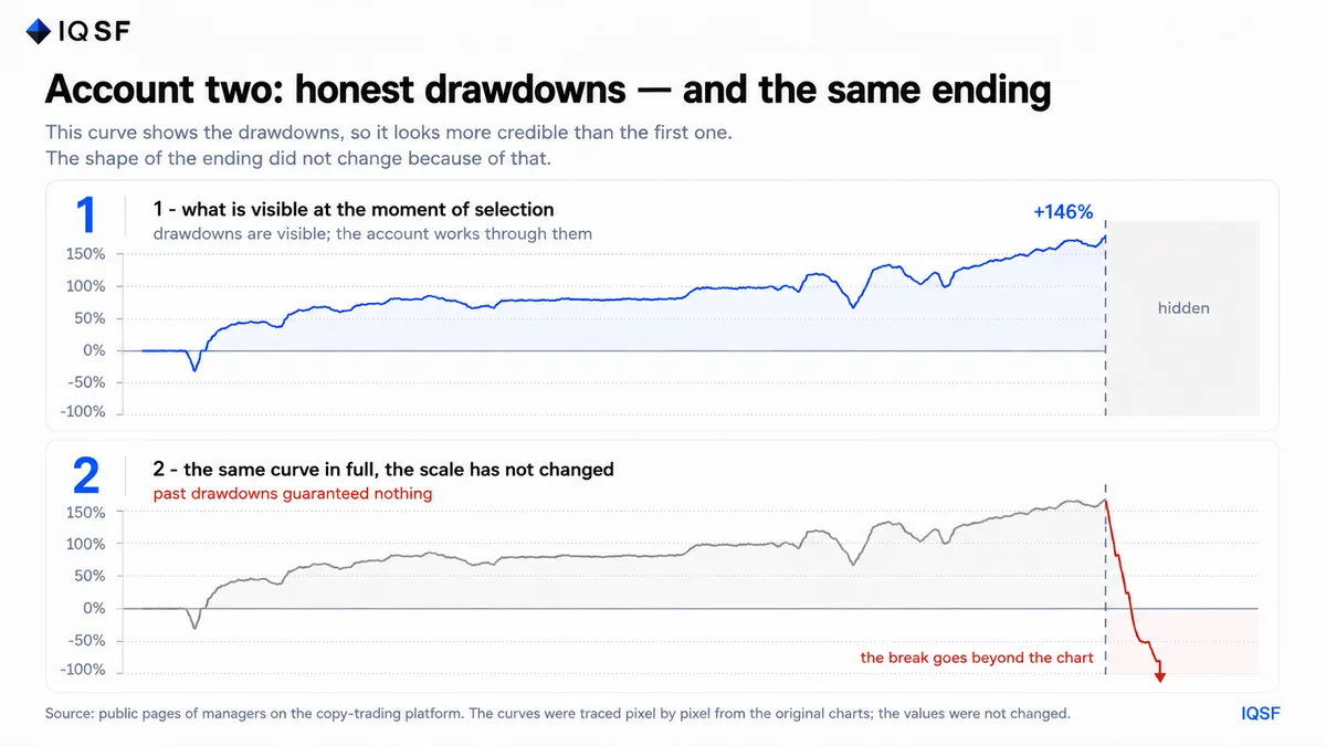
Chart 3. A curve with honest drawdowns: a drop at the beginning, two visible pullbacks during the growth, and a rise to +146%. Less than two percent of the chart width remained hidden under the placeholder, and exactly there the same vertical collapse occurred, with the bottom not even fitting inside the frame.
The presence of drawdowns in the past did not guarantee anything. They showed that the account could handle unfavorable periods of the previous scale, but said nothing about what would happen during a movement of a different scale. This is the illusion of reliability: a previous deposit drawdown is perceived as a passed stress test, although it only tests the scale of movement that has already happened.
The size of growth does not predict the size of the account collapse
Three cases side by side. Green shows the maximum the account reached. Red shows where it ended up.
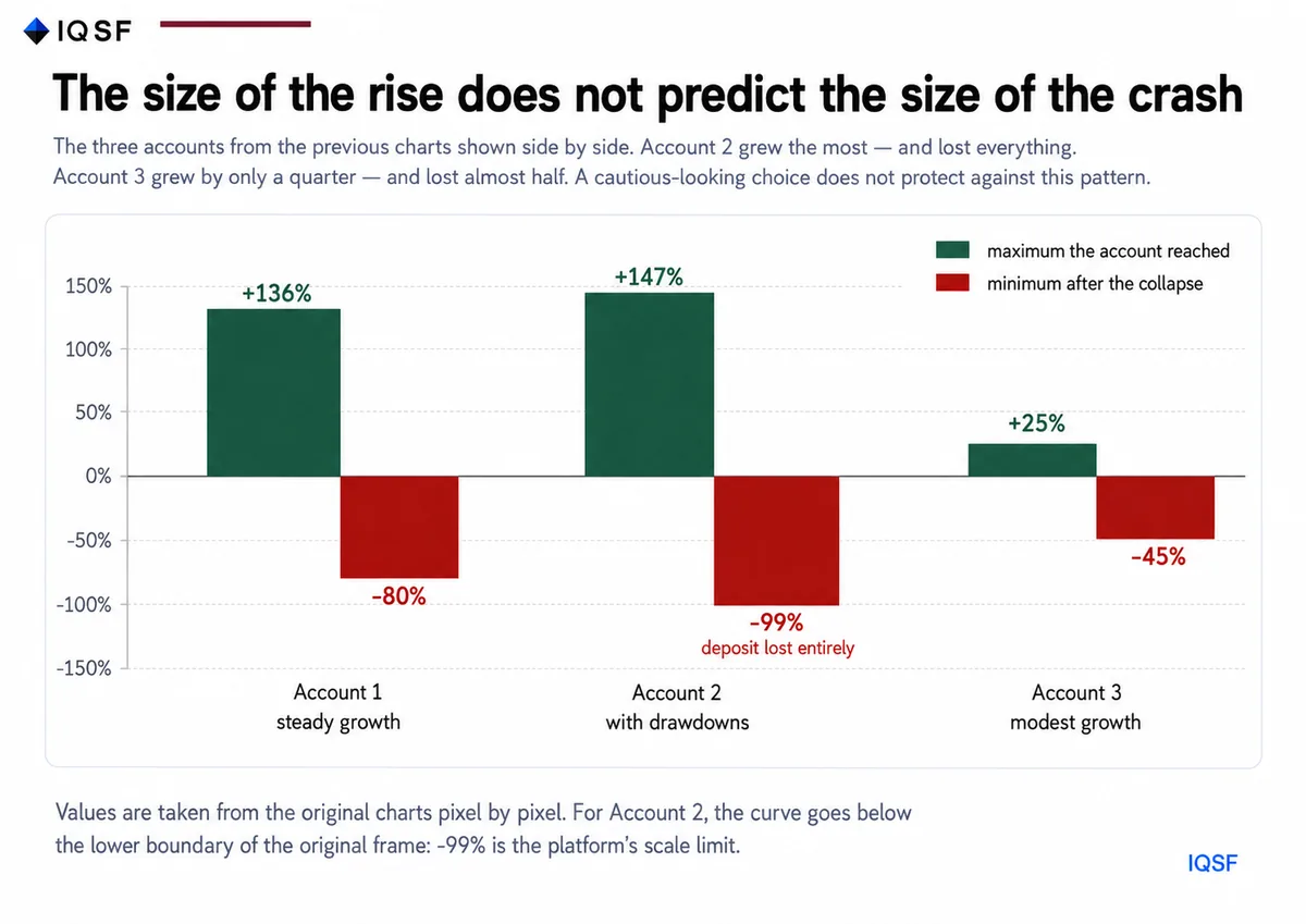
Chart 4. The size of the growth and the size of the collapse are not connected. Account 2 grew the most and lost the entire deposit: its curve goes below the lower boundary of the original platform chart. Account 3 grew only by a quarter and lost almost half.
This answers the natural objection: “I just will not choose aggressive strategies.” A cautious choice inside the same structure does not protect you. It changes the size of the green bar, but not the nature of the red one. Evaluating strategy risk by the size of return does not work in principle, because these are two independent variables.
Two charts, one choice: how to choose a strategy and make a mistake
In reality, you rarely look at strategies one by one. Usually, you have several options in front of you and need to choose one. Imagine two charts opened over the same five-month period.
Chart A grows almost without drawdowns, and every month closes in profit. It looks reliable and inspires trust in the chart. Chart B is in a drawdown: several months in a row are negative, and it creates doubts. Which one will most people choose? The question is rhetorical.
Now look at what happened next. On the day of a sharp market movement, Chart A collapsed vertically: everything accumulated over months disappeared in one session, and the account went to zero. Chart B reached its bottom on the same movement within a pre-calculated risk framework, reversed, began to recover, and several months later updated its highs.
Over a short segment, a strategy with hidden risk always looks more attractive than a strategy with honest risk control. The risk of the first one has not yet materialized. The risk of the second one has already appeared as a drawdown, and that is exactly why it looks less reliable. This is the psychology of trading applied to selection: comfort of observation and system quality are often inversely related.
This shape has a name: the poker-shaped curve
A steady rise followed by a sharp fall is a poker-shaped curve. It is not a random failure, but a direct consequence of how the trading strategy is built internally. It is described not by return and not by risk, but by payoff shape: how profits and losses are distributed over time.
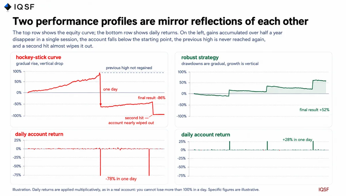
Chart 5. Two result profiles. Above is the account curve, below is daily return. On the left, +70% accumulated over six months disappears in one session: a -72% day takes the account to -52% from the start. Then comes a weak recovery that never gets close to the previous high, and a second hit of -78% leaves only one seventh of the account. On the right, the rare large event is profitable, with a final result of +52%.
They are mirror images of each other, and this is the whole point. The first profile feels comfortable every day: it confirms every day that the decision was correct, and ruins the account once. Pay attention to where it ends up: not at zero profit, but below the starting point. After the collapse, the curve crawls upward for months without approaching the previous peak, until the second similar day finishes off what is left. The second profile is uncomfortable almost all the time. It regularly shows small losses and makes you doubt it. It earns exactly where the first one loses: on a sharp market movement.
Over a short segment, the first profile always looks better because its vertical part has not happened yet. The second looks worse because its vertical part is exactly what has not yet happened. People choose based on the visible part. Strategies differ in the invisible part.
Why a strategy with a 20% win rate can be profitable
The second profile is easy to mistake for an unprofitable one: it has more losing trades than winning trades. The arithmetic says the opposite. Suppose four trades out of ten are profitable with an average result of +4%, and six trades are losing with an average result of -1%. Then the expected value of one trade is:
0.4 x 4% – 0.6 x 1% = +1%.
Six failures out of ten, and still a stable positive result over time.
Here is what a real series can look like:
- -1.0%
- -0.8%
- -1.2%
- -0.9%
- +6.0%
- -1.0%
- -0.7%
- +5.5%
- -1.1%
- -0.8%
Only two trades out of ten are profitable. The win rate is 20%. The total of eight losses is -7.5%. The total of two gains is +11.5%. The final result is +4.0%. From the outside, this looks like a strategy that is wrong almost all the time. In substance, it did exactly what it was supposed to do: it limited every failed attempt and fully used two strong moves. This is risk management in its pure form: the size of the loss is predefined, while the size of the profit is left to the market.
A 100% win rate is not an achievement, but a description of the shape
The payoff shape does not always need to be found on a chart.
Often, trading statistics show it directly.
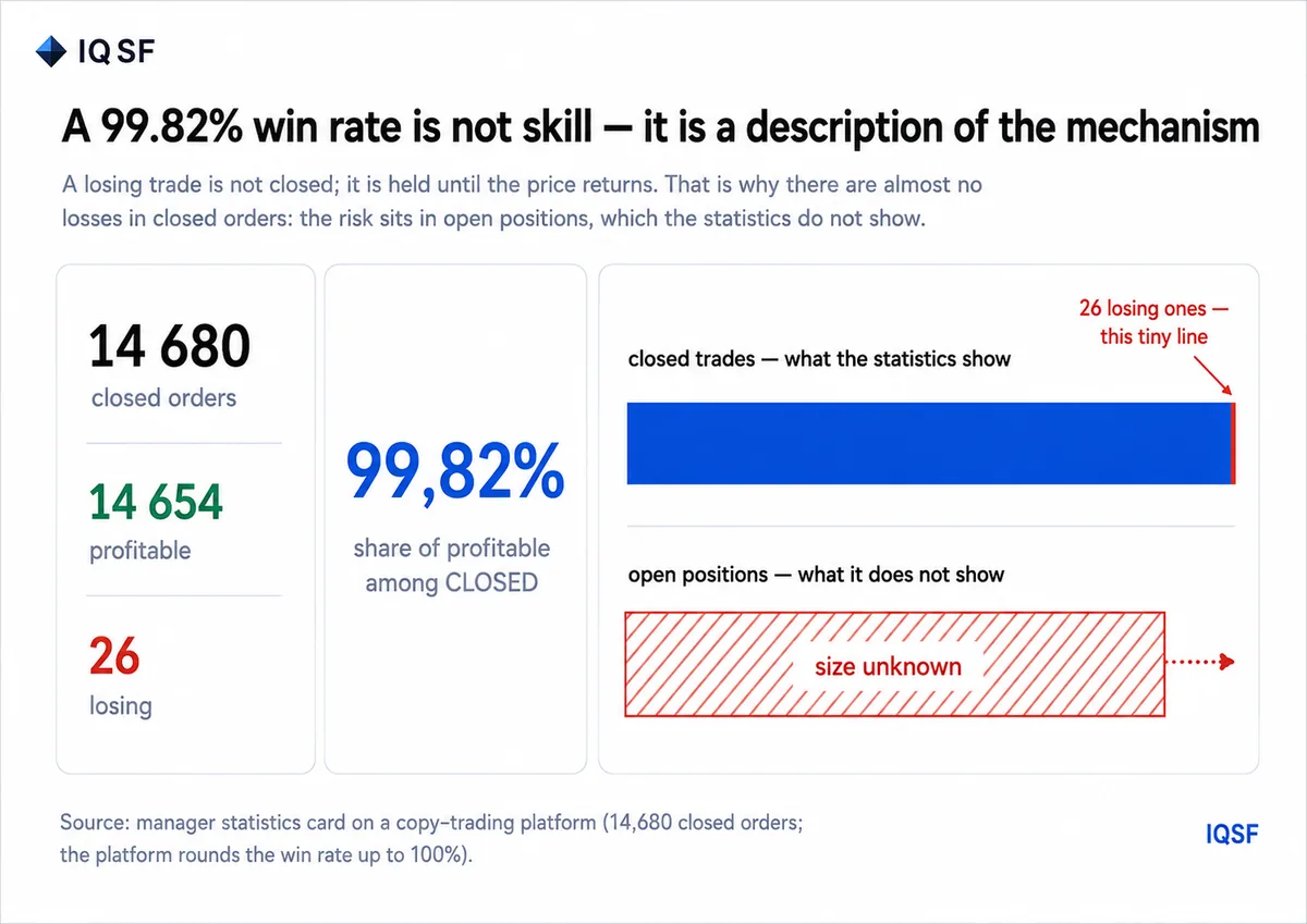
Chart 6. Statistics of a real manager: 14,680 closed orders, 14,654 of them profitable and 26 losing. The platform rounds 99.82% to “100%”.
An almost perfect win rate looks like proof of skill, but in reality it is the signature of a specific mechanism. The losing trade is not closed. The position is averaged until the price returns. As a result, there are almost no losses in closed trades. They accumulate in open positions, which this statistic does not show at all.
The math is simple, and leverage trading is important here. A position with 10x leverage loses the entire collateral if the price moves 10% against it. Each averaging step lowers the average price, but also increases the position size. After three or four additional entries, the distance to liquidation shrinks to only a few percent. As long as the market moves within its usual range, the scheme reliably closes trades in profit, and that is exactly what appears in the statistics. On the day when the price moves 14% without a pullback, there is nothing left to close: a margin call arrives, and the position is liquidated entirely.
The right question to ask about such a profile is this: if only 26 trades out of 14,680 were losing, where are the losses? The answer is in open positions. And they will all close at once, in one day.
The practical value of this signal is that it can be seen before the collapse and without a long history. The closer the win rate is to 100%, the closer the profile is to the poker-shaped curve. For those studying trading for beginners, this is the fastest filter available: it does not require return analysis or access to someone else’s trading.
How common this is in cryptocurrency trading
Cryptocurrency trading amplifies this effect. Round-the-clock trading, high leverage, and the absence of session breaks mean that the outcome can arrive at any hour. Three examples could still be dismissed as selective. But it is enough to open the copy trading section on any major exchange and remove the time filter. By default, it usually shows 30 or 90 days, exactly the period over which the poker-shaped curve still looks respectable.
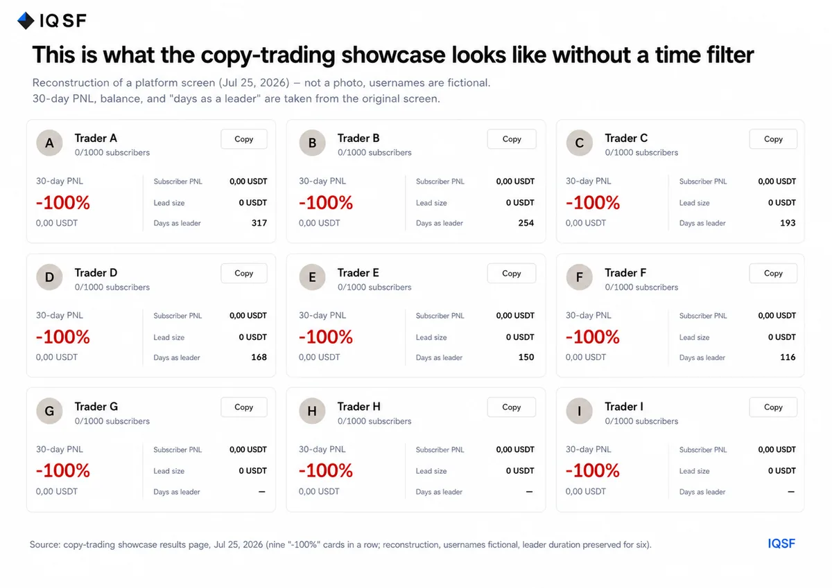
Chart 7. Reconstruction of a copy trading results screen: nine cards in a row, each with 30-day PnL of -100% and a balance of 0.00 USDT. Nicknames are fictional, but the structure and numbers come from a real screen.
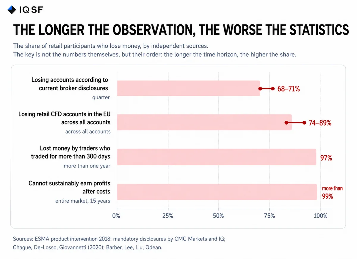
Chart 8. Six out of nine cards show the account lifetime: the horizontal axis shows how many days the account was public before going to zero.
What matters here is not the -100%.
What matters is the duration: 116, 150, 168, 193, 254, 317 days.
These were not beginners who failed in the first week. They ran public tracks for four to ten months, gathered subscribers, and then went to zero.
The 30-day filter does not distort the data. It simply shows the period before the outcome.
This is not a sample of unlucky accounts. This is the norm: long-term statistics
Nine accounts on one screen are still only a specific case. So next come data that we did not collect ourselves: regulators who required brokers to disclose statistics, and academic studies based on complete trade databases.
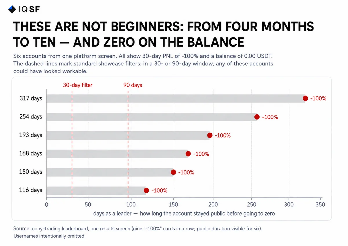
Chart 9. Share of participants losing money according to independent sources. The order from top to bottom reflects the lengthening of the observation horizon.
| Source and observation horizon | Share losing money |
|---|---|
| Mandatory broker disclosures, current | 68-71% |
| Industry-wide regulatory summary, ESMA 2018 | 74-89% |
| Traders who lasted more than 300 days, Brazil, 19,646 people | 97% |
| Day traders with sustainable results, Taiwan, 15 years | Less than 1% profitable |
The most revealing line is the third one. Brazilian researchers took everyone who started trading mini index futures in 2013-2015: 19,646 people, with no survivorship selection. Among those who lasted more than 300 days, 97% lost money. Only 1.1% earned more than the minimum wage.
But the order of the numbers matters more than the individual figures. In current broker disclosures, the share of losing accounts is 68-71%. In the regulator’s industry-wide summary, it is 74-89%. Among those who lasted a year, it is 97%. The longer the observation horizon, the worse the statistics become. That is exactly what this article is about: a short chart segment hides the outcome, while a long one reveals it.
Separately, there is the Taiwan study, which analyzed complete trading records over fifteen years. Fewer than 1% of day traders were able to make sustainable profits after costs. This does not mean that all the others went to zero. Some simply did not have a repeatable result. But it does mean that the ability to repeat a result is rare, and it cannot be determined from a short segment.
What really tests a strategy
An account collapse almost never happens because of a bad month. It happens on a specific day when the market moves in a way the model did not expect.
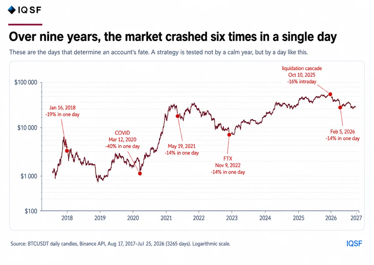
Chart 10. Bitcoin since 2017, logarithmic scale. Red marks the days when the market collapsed in a single day. Binance data, 3,267 daily candles.
| Date | Bitcoin: one-day collapse |
|---|---|
| January 16, 2018 | -19% by close, up to -33% intraday |
| March 12, 2020 | -39% in one day |
| May 19, 2021 | -14% by close, up to -30% intraday |
| November 9, 2022, FTX collapse | -14% |
| October 10, 2025 | -16% intraday, liquidation cascade |
| February 5, 2026 | -14% in one day |
Crashes of this scale happen roughly once every year or year and a half. But if we include smaller days, when Bitcoin fell 10% or more from the open to the intraday low, even if part of the fall was recovered by the evening, then in the last three and a half years alone there were nine such days. In addition to October 10, 2025 and February 5, 2026, they include August 17, 2023; January 3 and January 12; March 5; April 13; August 5, 2024; and January 31, 2026. On average, this happens once every four to five months.
This leads to an important conclusion for strategy risk assessment: such a day is not a black swan, but a regular feature of the market. A black swan is, by definition, unpredictable and happens once. Here, daily volatility of this scale appears several times a year. Any strategy that operates for more than six months almost certainly goes through such a day, and therefore must be prepared for it in advance.
Now take a chart of a strategy that has been rising smoothly for six months, and place a vertical line on any of these dates. Everything that accumulated over months is resolved within a few hours of that day. This is what the ending looks like: not a month of bad results, but one session.
Here the profiles finally diverge. A strategy with a smooth curve goes to zero on such a day because the accumulated profit was payment for hidden risk, and on that day the bill comes due. The main question appears: what difference does it make how much it earned and how convincing it looked if it did not survive the shock?
A quick check before making a decision
Everything described above comes down to four questions.
They take a few minutes and do not require access to someone else’s trading.
- What is the longest continuous track record of one strategy? Not a sum of achievements over ten years, but one strategy with one start date.
- What happened to it on the sharp market crash days listed in the table above? If the track record does not cover them, the stress test has not happened yet.
- What is the win rate, and where are the losses? A win rate above 90% requires showing open positions, not only closed trades.
- What was the maximum deposit drawdown, and how long did recovery take? No answer is also an answer: there has not been a drawdown yet, which means there is no data on behavior during it.
We analyze these curves and market mechanics in our channel: t.me/IQSF_Alpha. There are also monthly strategy updates there, including months closed in negative territory and the current open drawdown.
This is not individual investment advice. The equity curves were taken from public copy trading pages of third-party platforms and redrawn without changing the values; manager names are not shown. Bitcoin data: Binance, daily candles. Statistics on losing accounts: ESMA product intervention 2018, summary of national regulators; mandatory disclosures by CMC Markets and IG; Chague F., De-Losso R., Giovannetti B., “Day Trading for a Living?”, 2020; Barber B., Lee Y.-T., Liu Y.-J., Odean T., “The Cross-Section of Speculator Skill: Evidence from Day Trading”. Past performance does not guarantee future returns.
Frequently asked questions
Why can a copy trading account with a smooth equity curve and no drawdowns still be risky?
A curve without drawdowns does not mean low risk, it only means the risk has not materialized yet. Strategies that look best over a short one or two month window are often the ones that collapse hardest on the first real market shock, sometimes falling from strong gains to below the starting point within hours. The size of past growth does not predict the size of a future collapse, since they are independent variables.
Why can a trading strategy with a low win rate, like 20 percent, still be profitable?
Profitability depends on the size of wins and losses, not on how often a trade wins: in one real series only two trades out of ten were profitable, a 20 percent win rate, yet eight losses totaling minus 7.5 percent were outweighed by two gains totaling plus 11.5 percent, for a net plus 4.0 percent. A strategy that caps every loss at a small, predefined size while letting a couple of large moves run can stay profitable at a win rate this low.
What does a near 100 percent win rate in trading statistics actually mean?
An almost perfect win rate is usually the signature of a martingale style mechanism, not skill: a losing trade stays open and gets averaged down until price returns, so losses stay invisible while they build up off the books. One real example had 14,680 closed orders with only 26 losses, a 99.82 percent rate the platform rounds to 100 percent. The closer a win rate sits to 100 percent, the closer it is to this hidden risk pattern.
What share of retail traders actually lose money over the long run, according to independent data?
Independent sources show the share of losing traders rising with the observation period: mandatory broker disclosures put it at 68 to 71 percent, an ESMA regulatory summary at 74 to 89 percent, and a study of Brazilian futures traders past 300 days found 97 percent lost money. A separate fifteen year Taiwan study found fewer than 1 percent achieved sustainable profits. A short window hides the eventual outcome, a long one reveals it.
What should you check before choosing a strategy to follow in copy trading?
Four checks matter most: the longest continuous track record of a single strategy from one start date, its performance on sharp market crash days that have already happened, the win rate together with where any losses are hiding, especially above 90 percent, and the maximum deposit drawdown with how long recovery took. A track record with no drawdown at all simply has not been stress tested yet.