Can You tell a random chart from a real one? Experts can’t
In this article, we explore why even experienced traders cannot reliably distinguish real market data from random noise, how the human brain creates patterns where none exist, and why true investment edge comes not from beautiful chart formations, but from statistics, market behavior, and robust systematic processes.
In 1973, Burton Malkiel, a Princeton professor and future author of the bestseller A Random Walk Down Wall Street, conducted an experiment that later became a classic in investment literature.He asked his students to flip a coin 200 times. Heads meant the price of a hypothetical stock would rise by half a point. Tails meant it would fall by half a point. Based on the results, he plotted a price chart.
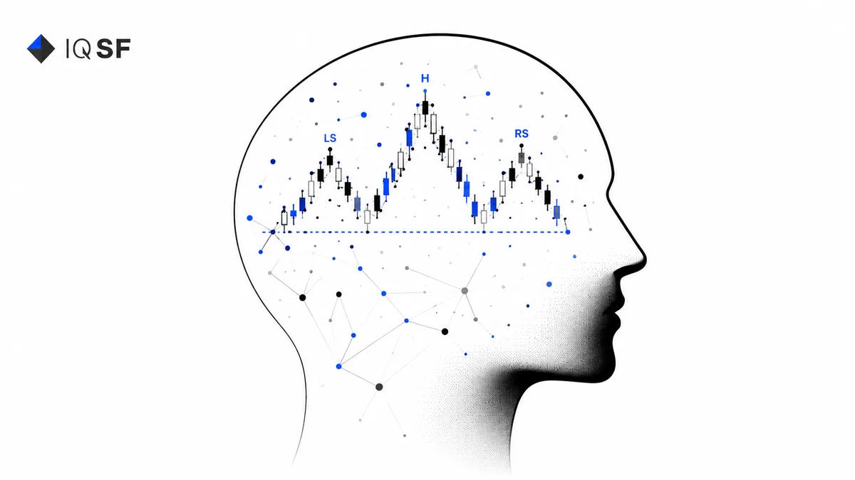
The chart contained all the classic patterns of technical analysis: support and resistance levels, head-and-shoulders formations, bullish and bearish flags, double bottoms, and more.
Malkiel then showed the chart to a well-known technical analyst without revealing its origin. The analyst carefully studied the curve, drew trend lines, identified key levels, and delivered his verdict:
“This is a stock that should be bought immediately. There’s a strong breakout from a developing pattern.”
There was no stock. The chart was pure random noise. Yet the analyst saw a compelling pattern.
The Experiment Has Been Repeated Many Times
Since then, variations of this study have been replicated repeatedly.
In 2014, a group of researchers from Cornell University conducted a series of blind tests with professional traders. Participants were shown pairs of charts: one based on actual S&P 500 price data, the other generated by a random-walk algorithm with similar volatility.
The task was simple: identify which chart was real.
The accuracy rate was approximately 51%—statistically indistinguishable from a coin flip.
The experiment has since been repeated multiple times with similar results: neither experience, professional certifications, nor years in the market help participants reliably distinguish genuine market data from noise.
In 2009, Hasanhojic and Lo from MIT performed a similar experiment involving the hedge fund industry. Participants were shown equity curves from real funds mixed with randomly generated ones.
Market professionals performed no better than chance.
Why the Brain Sees Patterns That Don’t Exist
The tendency to perceive meaningful structures in random data is known as apophenia.
This is not a flaw in human cognition. From an evolutionary perspective, it was highly advantageous.
An individual who interpreted a rustling sound in the bushes as a tiger often survived more frequently than one who ignored it. The cost of a false positive was much smaller than the cost of missing a genuine threat.
In financial markets, however, the same mechanism works against investors.
The brain detects patterns where none exist and reinforces confidence with memories such as: “I’ve seen this exact setup before.”
The illusion of repetition creates conviction. Conviction leads to a trade. The trade generates commissions for brokers. Over thousands of repetitions, the statistical outcome often converges toward randomness.
Neuroimaging studies suggest that recognizing familiar patterns activates reward-related regions of the brain.
In other words, seeing a pattern is physiologically more satisfying than seeing nothing at all.
Psychologically, humans are optimized to detect patterns – not their absence.
So What Does Technical Analysis Actually Do?
This does not mean technical analysis is completely useless. It works- but not for the reason most people assume.
Trend lines and chart patterns do not predict the future by themselves. Instead, they can become partially self-fulfilling.
If thousands of traders identify the same support level, many of them place stop orders, limit orders, or automated signals around that price. A concentration of orders forms.
When the market reaches that area, price reacts to the accumulated liquidity. The level appears to “work,” not because it contains hidden information about the future, but because it reflects coordinated behavior in the present.
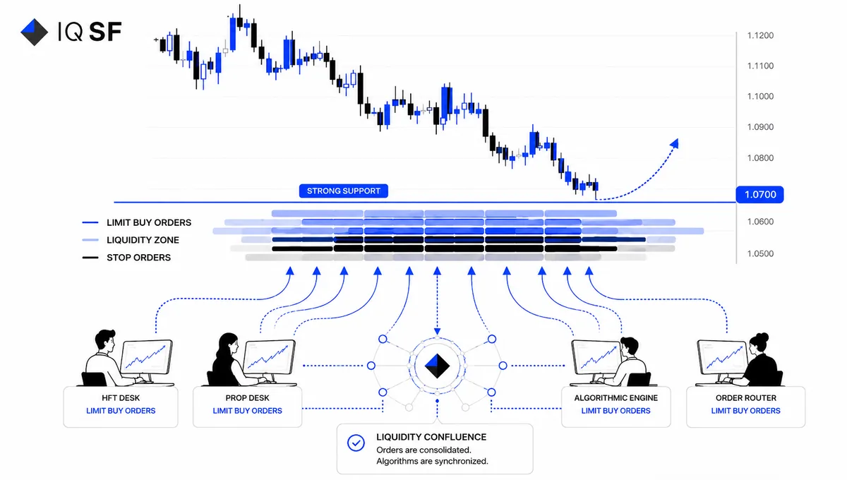
The same principle applies to head-and-shoulders formations, triangles, and other classic chart patterns.
Millions of participants recognize them simultaneously. Their reactions occur simultaneously. The resulting price movement emerges from a coordinated flow of orders rather than from any prophetic power of the pattern itself.
This distinction matters.The edge is not in the lines.The edge is in the collective behavior of market participants. А chart pattern is a map of expectations, not an objective property of the asset.
Where the Real Edge Comes From
If technical analysis works primarily because of crowd coordination, it has an inherent limitation.
Any pattern that becomes too widely known often turns into a source of heightened volatility and may evolve into a trap as the market overreacts to anticipated behavior.
This is why professional quantitative strategies rarely derive their edge from visual chart interpretation.
Instead, they seek advantages in areas such as:
- Technological edge (speed, infrastructure, market access)
- Statistical edge (models that describe price behavior more accurately than competitors’ models)
- Behavioral edge (greater resistance to false signals than the average participant)
In every case, performance is measured not by a single candle or a beautiful chart pattern, but by statistics accumulated over thousands of trades and multiple market regimes.
What This Means for Investors
The next time you see a perfect chart pattern, ask yourself:
Is this valuable information about the future, or simply an attractive pattern that my brain constructed from random fluctuations?
Most of the time, it is the latter.
The same logic applies when evaluating investment funds or strategies.
A beautiful equity curve can be impressive, but by itself it says very little.
More important factors include:
- Length of track record (ten years tells a different story than two)
- Maximum drawdown and recovery time
- Stability of the Sharpe ratio across different market environments
- Amount of capital managed under the strategy
- Nature of the edge (what exactly the strategy exploits and why that advantage is sustainable)
A price chart is merely the final visible layer of data.
Beneath it lie deeper layers of market structure: order-book liquidity, trade flows, participant behavior, and market regimes.
Serious analysis focuses on these layers rather than on the surface appearance of the chart.
This is worth remembering when choosing a fund based solely on the visual appeal of its performance curve.
Often, behind an impressive chart lies a short observation period, favorable macroeconomic conditions, and the same phenomenon of apophenia—except now it affects the investor rather than the trader.
Can You Tell a Real Fund History from a Fake One?
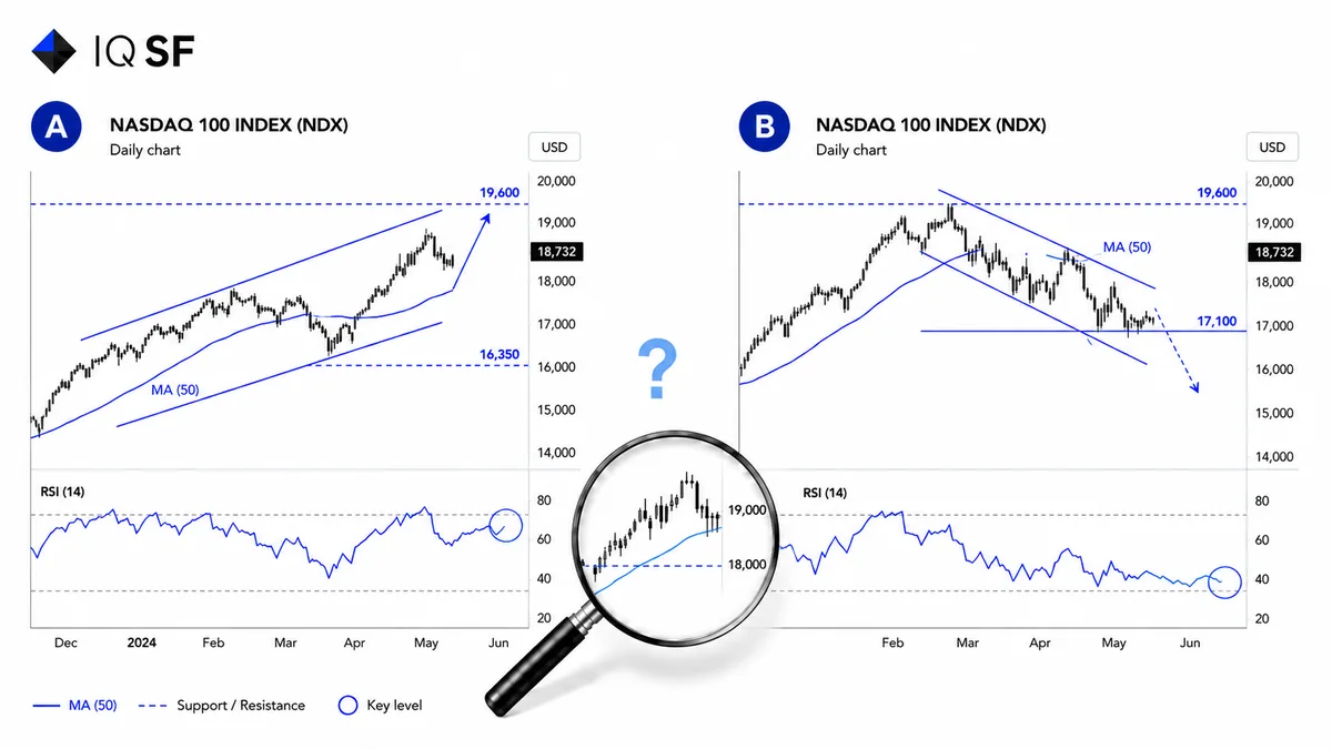
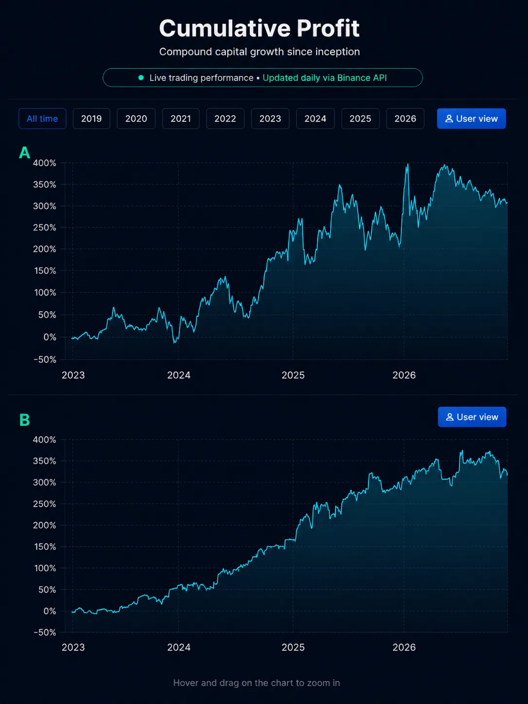
Below are two charts covering the period from June 2023 to June 2026. One is the real equity curve of our Basket 50 strategy. The other is a randomly generated walk created with the same starting value and average volatility.Support and resistance levels, local highs, reversals, drawdowns, and recoveries appear on both charts. Both can be described convincingly using the language of technical analysis. Which one is real?
Think before reading further.
The Answer
Chart B is the actual equity curve of the Basket 50 IQSF strategy from June 2023 through June 2026—three years of live portfolio management.
Chart A is a random walk generated by software in a matter of seconds using the same starting value and volatility profile.
If you guessed incorrectly – or hesitated- you are not alone.
A similar test conducted at Cornell achieved only 51% accuracy among hundreds of professional traders.That is the point at which technical patterns cease to be information and become decoration.
The same lesson applies when evaluating investment funds.
A beautiful equity curve without context—track record length, market regimes, assets under management, and the source of the strategy’s edge – is simply a pattern.
Beneath it may lie either a genuine investment process or a random walk onto which the human brain has projected the image of a future industry star.
#IQSF #Investing #BehavioralFinance #TechnicalAnalysis #Apophenia #RandomWalk #MarketNoise #RiskManagement #AlgorithmicTrading #FinancialMarkets #InvestorPsychology
Glossary
Trader — A market participant who buys and sells financial assets in pursuit of profit from price movements.
S&P 500 — A stock market index representing the combined value of 500 of the largest publicly traded U.S. companies. It is widely considered the primary benchmark of the U.S. equity market.
MIT (Massachusetts Institute of Technology) — One of the world’s leading scientific and technological research institutions.
Hedge Fund — An investment fund available primarily to qualified investors that employs a wide range of strategies and active risk management techniques.
Equity Curve — A cumulative performance chart showing how a fund’s or strategy’s capital has evolved over time.
Apophenia — The human tendency to perceive meaningful patterns and connections in random data. While evolutionarily useful, it can be detrimental in financial decision-making.
Stop Order (Protective Stop) — An automated instruction to close a position when price reaches a predefined level, helping limit potential losses.
Sharpe Ratio — A measure of risk-adjusted performance. A higher Sharpe ratio indicates greater return earned per unit of risk taken.
Frequently asked questions
Can experienced traders tell a real price chart from a random one?
Not reliably. In a Cornell University test, professional traders correctly identified real S&P 500 charts versus random-walk charts only about 51% of the time, statistically no better than a coin flip. A similar MIT study using hedge fund equity curves found market professionals performed no better than chance.
Why does the brain see patterns in charts that aren't really there?
This tendency is called apophenia, and it is a byproduct of evolution: treating a rustle in the bushes as a possible tiger was more useful for survival than ignoring it, so the brain rewards pattern recognition by default. Neuroimaging studies show that recognizing a familiar pattern activates reward-related regions of the brain, so seeing a pattern is physiologically more satisfying than seeing nothing at all.
Does technical analysis actually work, or is it just an illusion?
It can work, but not because chart patterns predict the future. When many traders recognize the same support or resistance level, they place orders around that price, and the resulting concentration of liquidity is what makes the level react, a reflection of coordinated crowd behavior rather than a prophecy. The edge comes from this collective behavior, not from the lines themselves.
What should you actually check before trusting a fund's performance chart?
A single equity curve says very little on its own. What matters more is the length of the track record, since ten years tells a different story than two, along with maximum drawdown, recovery time, the stability of the Sharpe ratio across market regimes, and the amount of capital under management. The nature of the strategy's edge also matters more than how visually attractive the curve looks.